
Ariel Investments
Background
Ariel Investments is a global asset management firm based in USA and It serves both institutional and individual retail investors through mutual funds and separate account investment strategies.
The Challenge
Ariel needed a new website to better reflect their brand, simplify the user experience, and make their content more accessible to a broader audience.
Their existing site was outdated, hard to navigate, and failed to communicate the company’s story or engage prospective investors.
Cluttered layouts, industry jargon, and poor mobile usability—especially for financial data—made it difficult for users to find and understand key information.
My Role
Lead UX / Product Designer within an agency team, collaborating with: Digital Creative Director, Technical Director, Developers, Project Managers, Account Director, Senior Designer.
Worked closely with the client’s core project team and wider stakeholders.
- Client: Ariel Investments
- Agency: Brunswick
- Type: Corporate Website
- Platform: Web
- Industry: Financial Services

Platinum Winner 2023
Best website – Business to Business
Outdated and difficult to use
Ariel’s existing website was outdated and failed to showcase the compelling story of the company (founded in 1982).
The site was difficult to navigate, presenting too many choices and used industry jargon that prospective retail investors would find difficult to understand.
Most pages lacked visual hierarchy and contained lengthy text, making it difficult to scan and browse content.
The experience of using the existing site on mobile was very difficult; given its outdated design which was focused on a fixed-width desktop experience. The rendering of financial data tables was particularly challenging on mobile devices.

Ariel’s existing website
UX Research
As part of the project team, we held stakeholder interviews to align on Ariel’s business objectives and gain insight into their core user groups. This qualitative research was backed by Google Analytics data, which highlighted low engagement and inefficient user journeys on the existing site.
Our findings revealed three distinct audience types:
-
Institutional investors, focused on accessing in-depth performance data.
-
Retail investors, often new to investing, seeking education, reassurance, and a clear path to apply for mutual fund products.
-
Media and public users, looking for up-to-date news, Ariel’s story, and its values.
Based on these insights, I created a set of illustrated user needs and high-level journey maps. These became foundational tools for informing the site’s content structure, user flow, and interaction design.
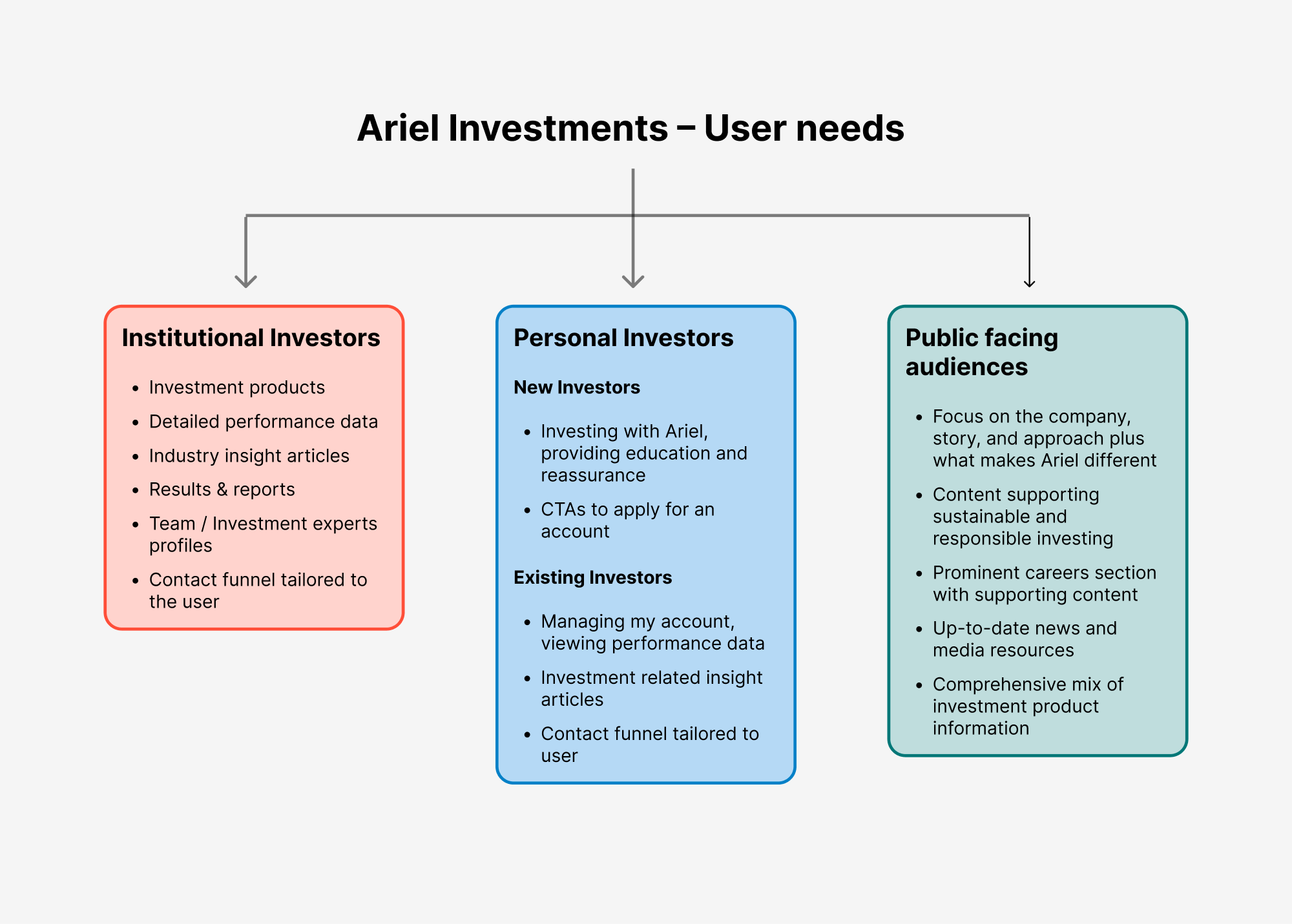
User needs
This framework outlines the distinct needs of Ariel’s three primary user groups, ensuring the new site would deliver tailored content, tools, and journeys for each audience segment.
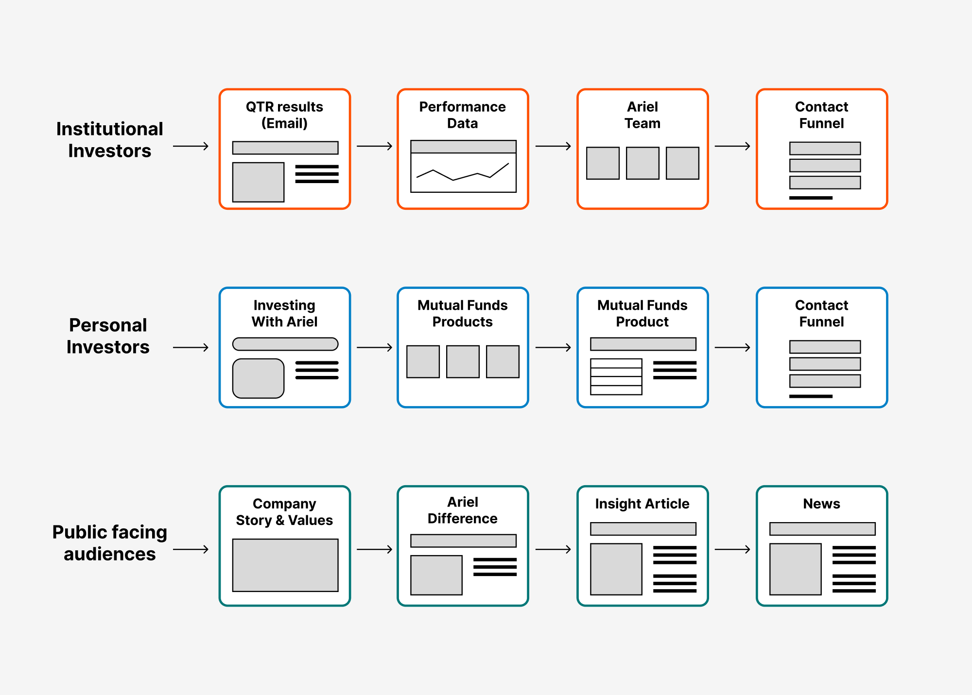
User journeys
These user journeys mapped typical paths for each audience, helping to streamline navigation and support key goals like engagement and conversion.
Information architecture
- I reorganised the site to make it easier to navigate (the existing site had deep, nested hierarchies that made key content hard to find).
- My approach was to flatten the structure so that all key pages could be reached within two clicks—improving accessibility, reducing cognitive load, and supporting faster task completion.
- I also introduced clear segmentation based on audience type (e.g., personal vs. institutional investors). This audience-led structure ensured users were guided directly to the most relevant content.

Wireframing
- For each user journey, I created wireframes, paying attention to optimising the page content making it easier for users to scan areas that interested them.
- I ensured that key CTAs like “Open an account” were place prominently at the top of pages, making them easy to see.
- For performance data, I designed flexible stock-market data tables. This approach made these adaptable to scan both on desktop and smaller mobile devices.
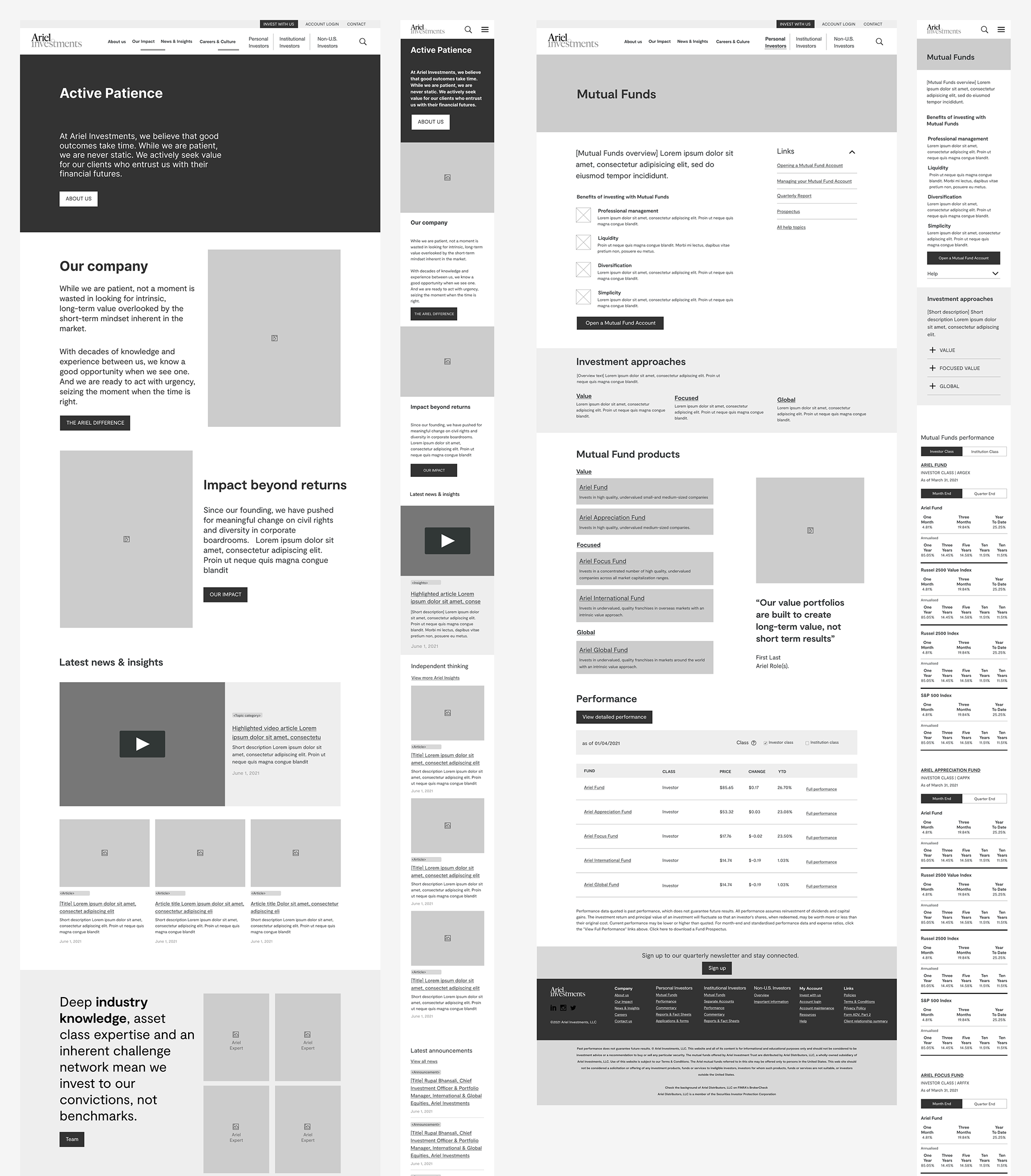
Navigation segmentation
- To help users quickly find content relevant to them, I designed the navigation to prominently segment by user type (e.g., institutional or personal investors).
- These entry points were clearly labeled and visually differentiated from the core site navigation, reducing friction and improving wayfinding.
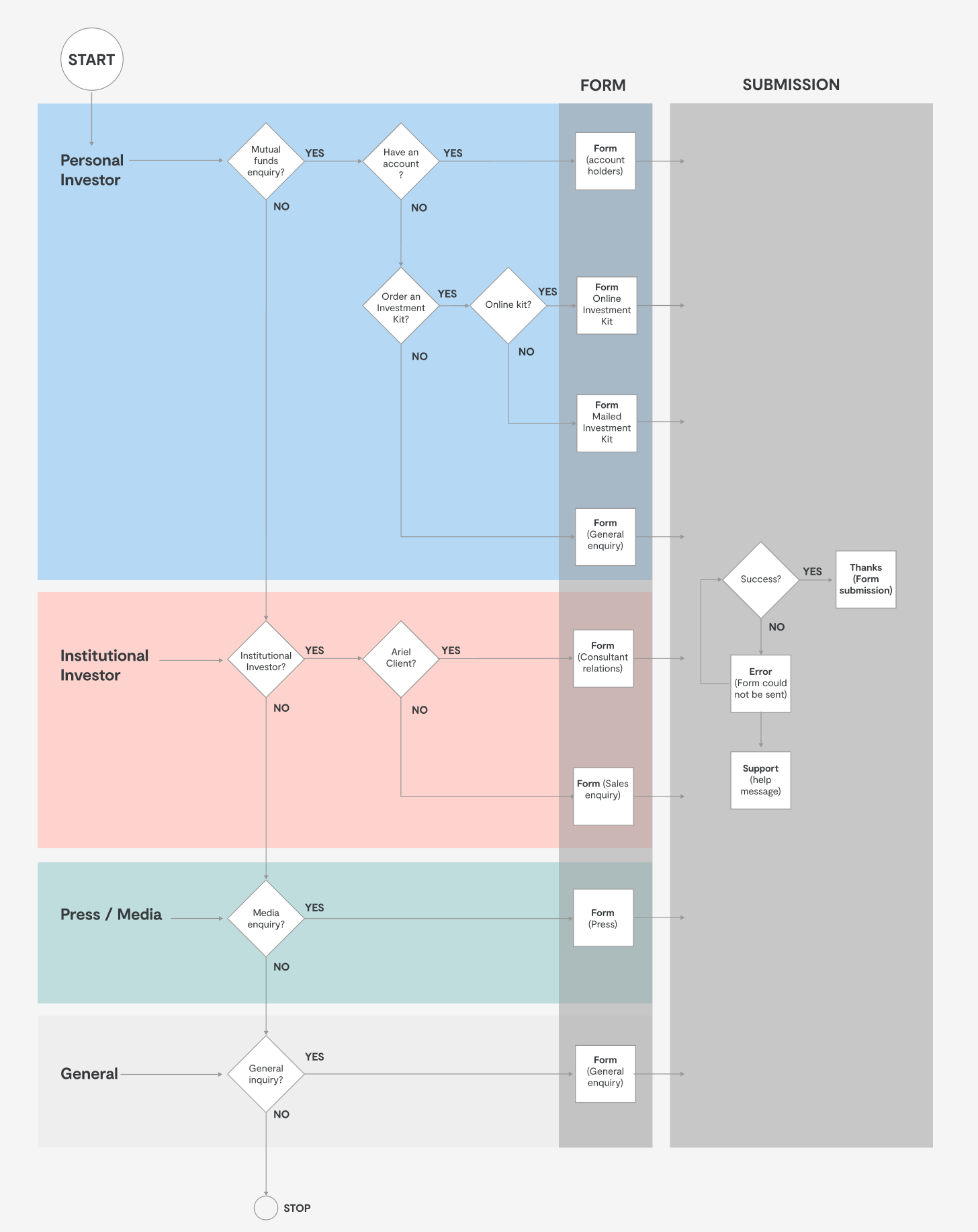
Contact funnels
- The central contact page was redesigned to adapt to both the user type and their status (e.g., new vs. existing personal investor).
- I created a guided flow using conditional logic—asking a few short questions to dynamically display the most relevant form fields.
- This not only improved the user experience but also allowed Ariel to better route and manage incoming enquiries based on user context.
Vibrant rebrand
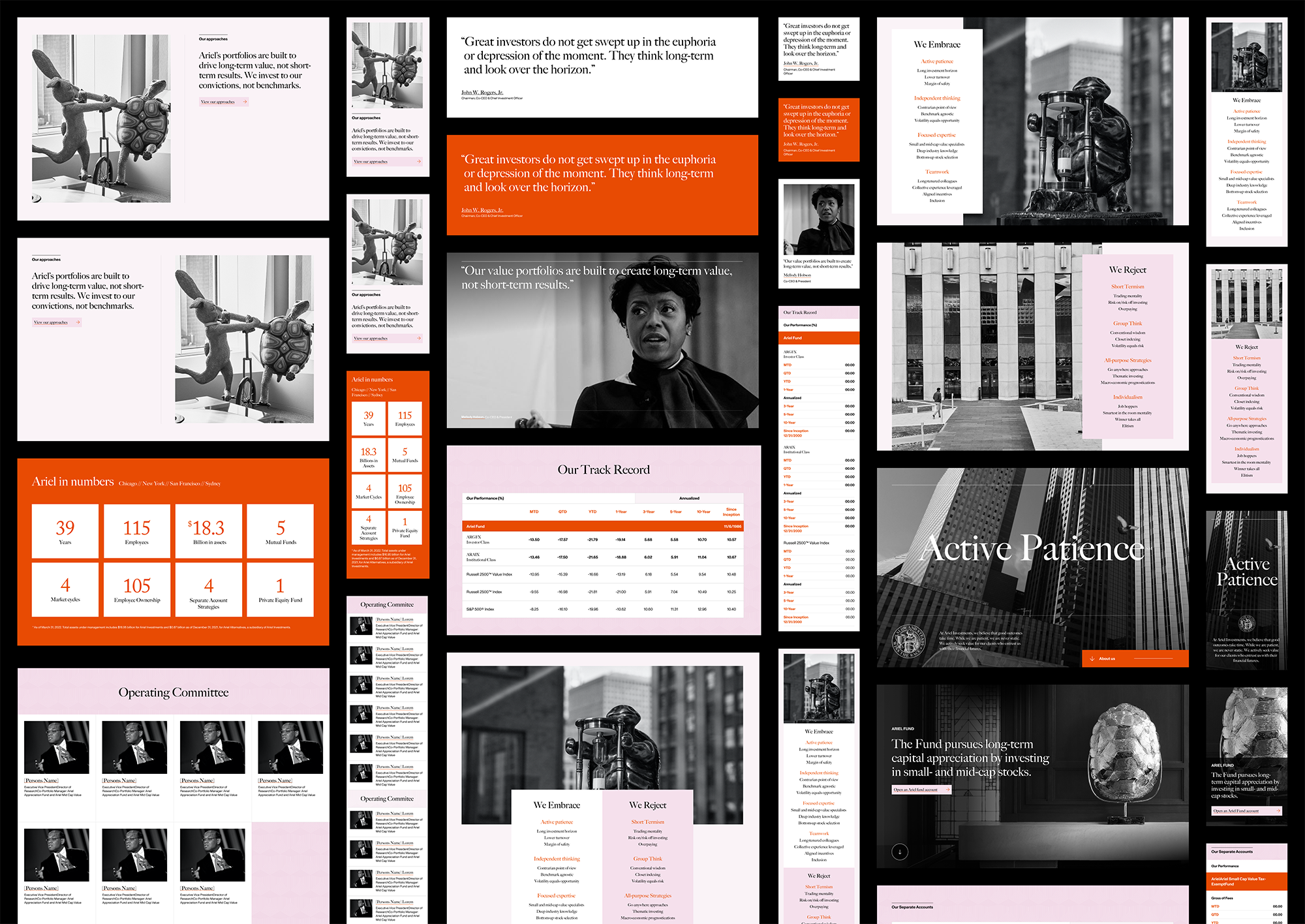
- I collaborated with UI designers to help bring to life Ariel’s new brand, which consisted of bold typography, stark black and white photography plus bright oranges and pink colours. This approach made the Ariel stand out from its competition with dramatic effect.
- The designs were grounded in the UX research and wireframes, ensuring the new look supported user needs and reinforced clarity and usability across all journeys.

Modular Design System
- I was responsible for translating the page designs into a flexible, modular design system, using Figma. This system ensured consistency across the site while accommodating the distinct needs of Ariel’s audience segments.
- I adapted all core web components to align with both the new visual identity and the user experience principles established earlier in the project.
- Throughout the build phase, I collaborated with the development team—providing detailed specs, prototypes, and feedback—to ensure smooth handoff and that the final implementation stayed true to the original UX vision.
Results
- User access via mobile increased by 30% after the relaunch of the site.
- Google analytics showed that users were completing their journeys successfully and in 100% less time than before, enabling to find content much quicker.
- Winner of the 2023 dotCOMM Platinum Award for Best B2B Website.
Client feedback
“…the team quickly became deeply embedded in our firm – taking time to gain an extensive understanding of our people, our clients, and every inch of our business. They then helped us organize ourselves, our goals, and made our dreams come true with this beautiful new site.”
Arielle Patrick, Chief Communications Officer
Ariel Investments